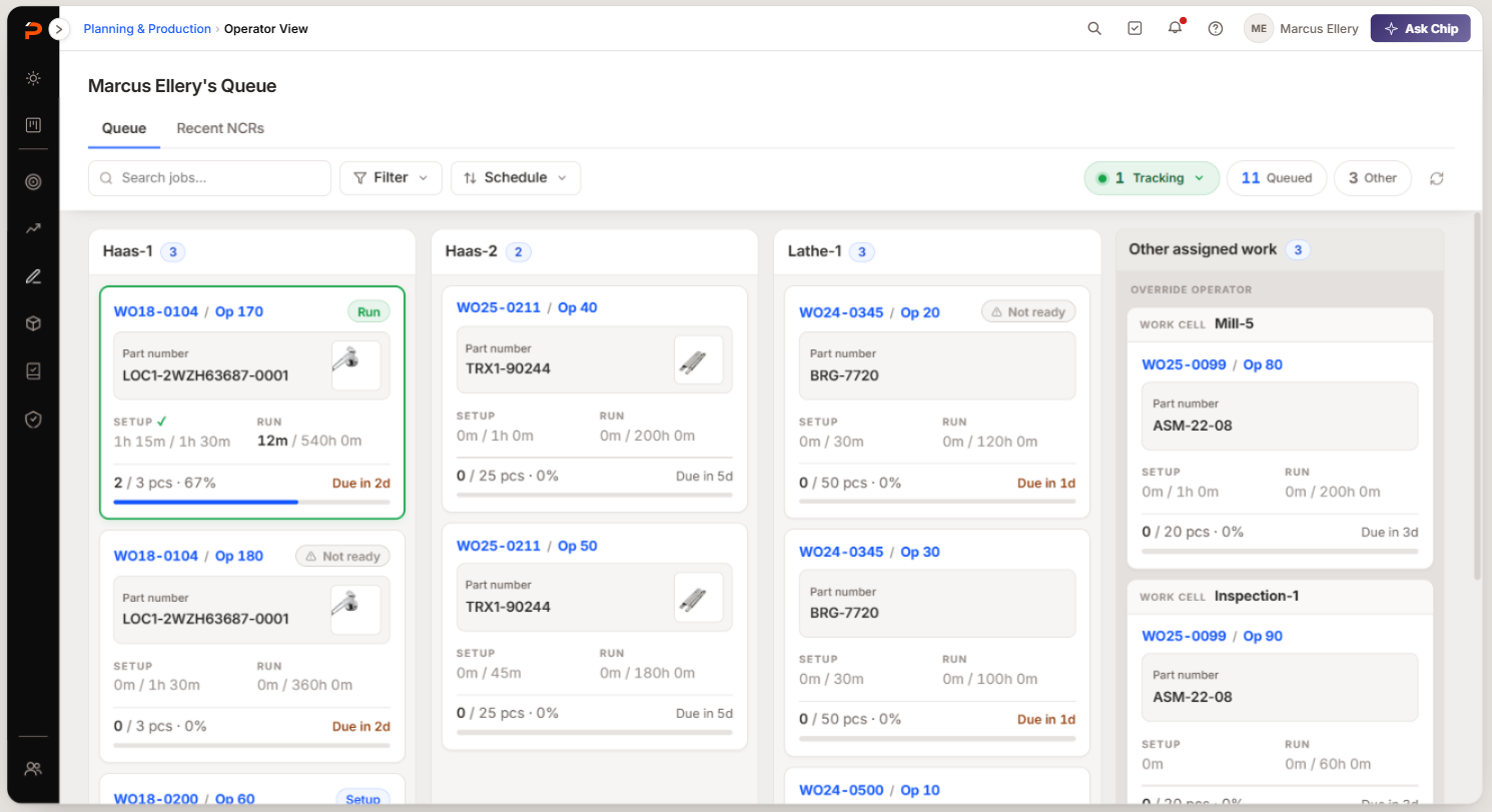
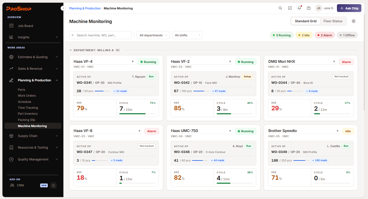
Machine Monitoring
The first tool built on ProShop's AI-native platform.
Launched at Lightning Strike, June 24.
I wasn't assigned to this project. I saw it hit the roadmap, recognized it as the module that would set the design bar for everything built on the new platform, and asked the PM and VP of Product to let me lead it. That's why I was in the room at PRD stage — and why the decisions below were mine to make.
In five weeks I taught myself an industry I'd never designed for, made three decisions the module still runs on, and escalated a cross-module gap that is now listed in our competitive analysis as a capability no standalone competitor can match.
Why shops were buying a second system
An ERP knows what work should be happening. A monitoring system knows what is happening. Almost no ERP does both — so a shop buys two systems, then pays a third time to connect them.
“Is 04 still cutting?”
Walk and ask
stale the moment you leave“I’ll know at end of shift.”
Hand-logged OEE
true after it matters“Two logins. Two bills.”
A second system
one more tool to runwired in from outside
$100–150
per machine, per month
a bill per machine
still sends everything
ProShop
what should runwhat is running
- one system, one bill
- no integration to buy
- only what earns space
- status tied to the work order
That integration cost is the whole argument.
Several early-access candidates were days from signing with competing vendors. One — Hill Manufacturing — paused a MachineMetrics evaluation because they wanted monitoring inside ProShop, not in a second vendor's interface. I designed against that sentence more than any persona document. They weren't asking for a better dashboard. They were asking not to leave ProShop.
Machine Monitoring didn't exist in ProShop, so every convention had to be decided rather than inherited. Our PM's POC answered what and why credibly, but not how best — and with one developer and five weeks, getting that wrong meant a bad foundation under everything the platform builds next.
If a data point doesn't change a decision, it doesn't earn space.
How might we turn a raw telemetry feed into something a shop supervisor can act on in the ten seconds they'll give it — and make it worth abandoning a tool they already pay for?
Three problems, three decisions
- 01 Monitoring and alerting are two different jobs One flat grid was trying to serve a desk and a wall at once
- 02 Opening one machine without losing sight of the rest A detail view that destroys the comparison you opened it for
- 03 Proving the machine is running the right job The controller knows a program name, not a work order
How three people shipped in five weeks
The second mandate on this project wasn't a feature: work out how a team collaborates using AI agents, and keep the method.
It wasn't a relay. Dev started backend work in week 2 while the design was still forming, which only worked because weekly syncs meant Paul was building toward a picture he'd already seen. Validation ran alongside implementation rather than after it, and the SME walkthrough at the end of week 4 was the one real gate in the whole schedule.
What AI did, and what it didn't
I used AI to break the PRD into its constituent decisions, run competitive research, and synthesize two years of Customer Advisory Board notes and product specs into the handful of findings that bore on a design decision. But the IA and workflow were mine, in Figma, first. The prototype's job was to test concepts I'd already formed — generating first and rationalizing after is how you end up defending an output you didn't choose.
-
Handoff stopped being a Figma file
It became a Figma file and a Claude Code repository — Figma for comprehension, running code for execution, so Paul could see what an interaction does rather than infer it from a redline.
-
Nothing broke in the handoff
I'd credit that less to tooling than to pairing with the PM to map real ProShop attributes into the prototype instead of mocking data.
-
The honest caveat
AI made producing an option nearly free, which makes judgment the scarce resource. So it went to the handful of decisions expensive to reverse, and everything else moved fast.
Monitoring and alerting are two different jobs
The POC had one flat grid, and I first read this as a sizing problem: the same view needs to work at a desk and across a shop. That's the shallow version. The real difference is job.
An ops manager asks "is the floor running well, and what do the numbers say?" Someone walking past a wall display asks "is anything wrong right now?" — and will never drill into anything, because they're on their way somewhere. One view serving both fails both.
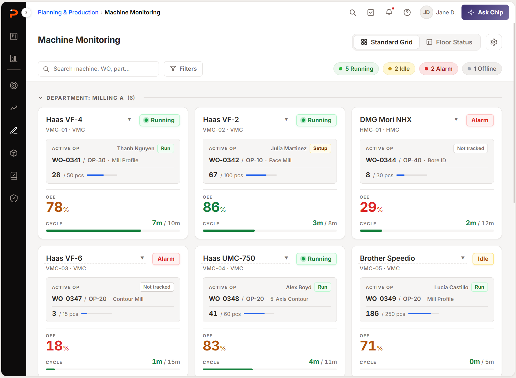
- WhoAdmins, ops managers, owners
- JobMonitor performance, read the metrics
- BehaviorEntry point to drill-down
- ContentStatus, OEE, active WO, cycle progress, grouping, filter and search
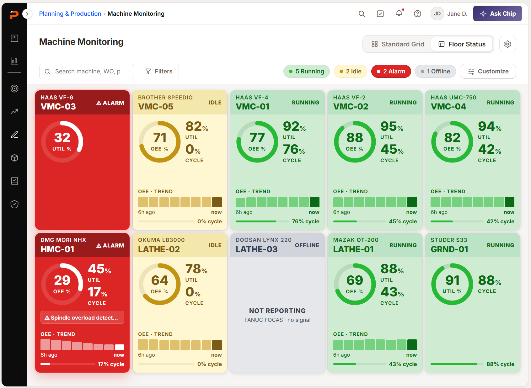
- WhoAnyone on the shop floor
- JobCatch what's wrong, fast
- BehaviorNo drill-down at all — diagnose, then walk to the machine
- ContentMachine name, status, active WO/part, OEE. Nothing else
Rejected Scaling the Grid card up for the TV — bigger type on the same layout still forces the eye to hunt for status among five other numbers. Legibility at distance is an editing problem, not a font-size problem.
What the shop floor taught me about the wall
I'd drafted Floor Status as a subtraction exercise: fewer things, bigger. Then I got onsite at CNC Swiss — 34 machines, three shifts, a lights-out run from midnight to 6am — and watched people read the floor.
They register the one in the back corner is red and turn around. Their machines were labeled A1, A2, B1, B2, and every one had its own indicator light. The floor was already running a spatial status signal that required no literacy at all.
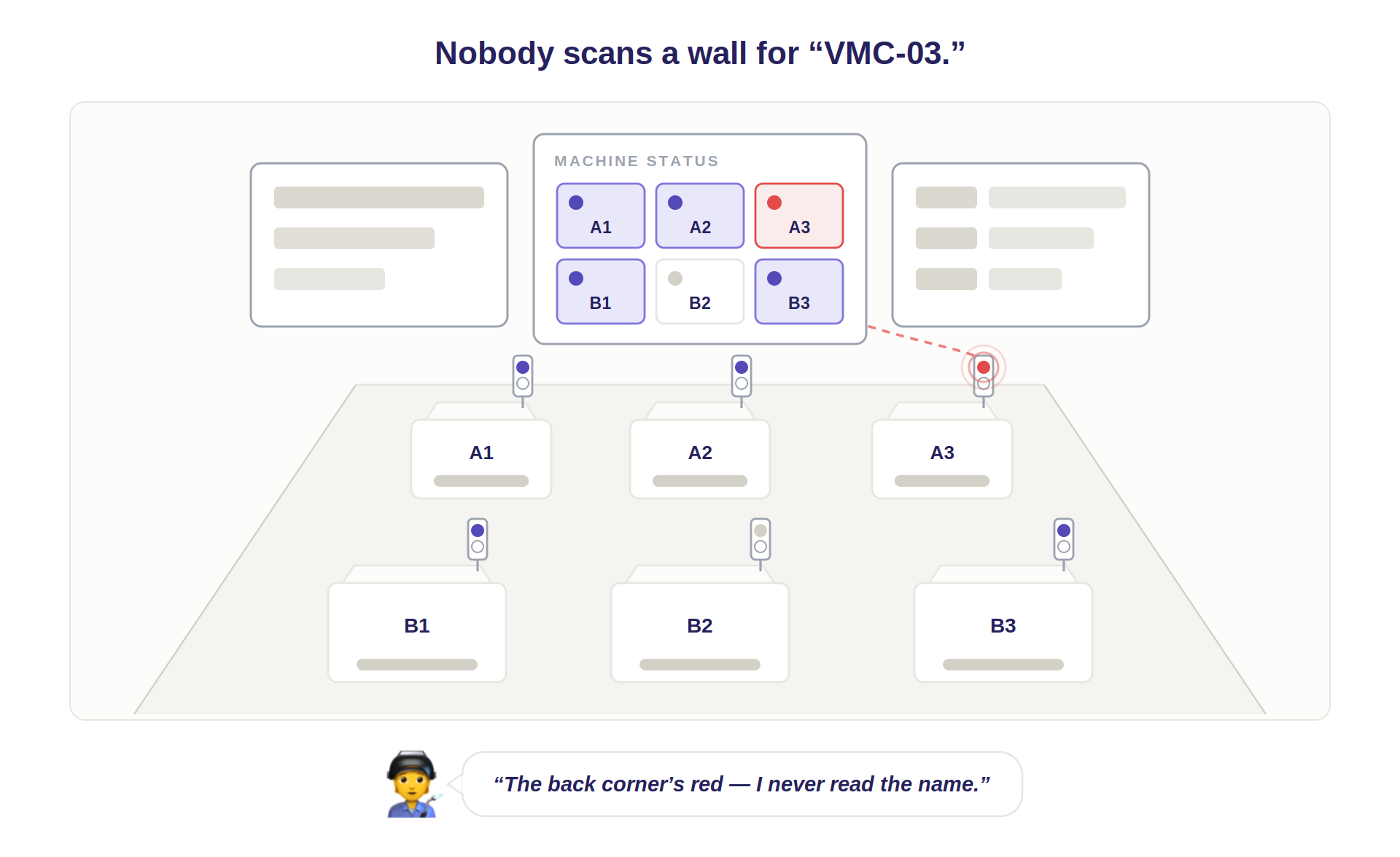
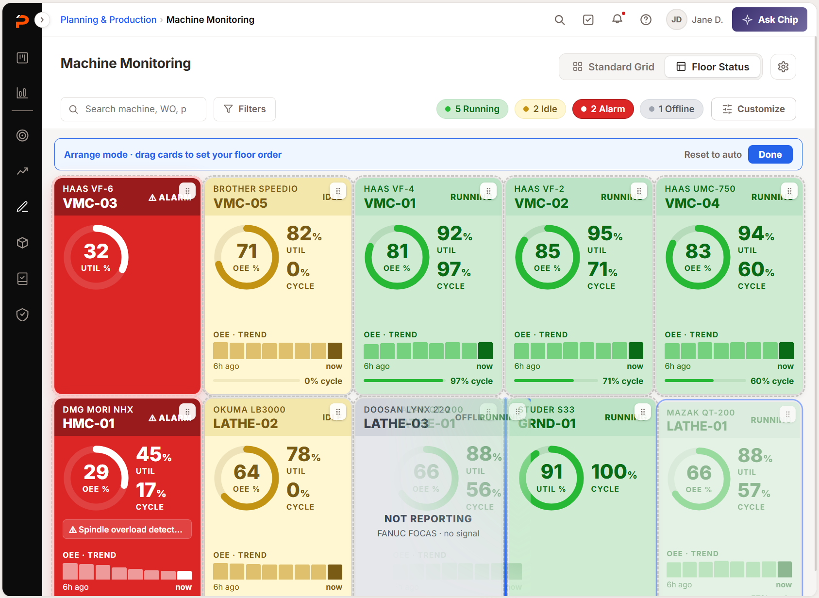
So Floor Status ships with card customization and a re-arrange mode — a shop orders the tiles so the board mirrors its actual layout. The display stops being a list and becomes a map, which is what turned that view from a smaller dashboard into a spatial one.
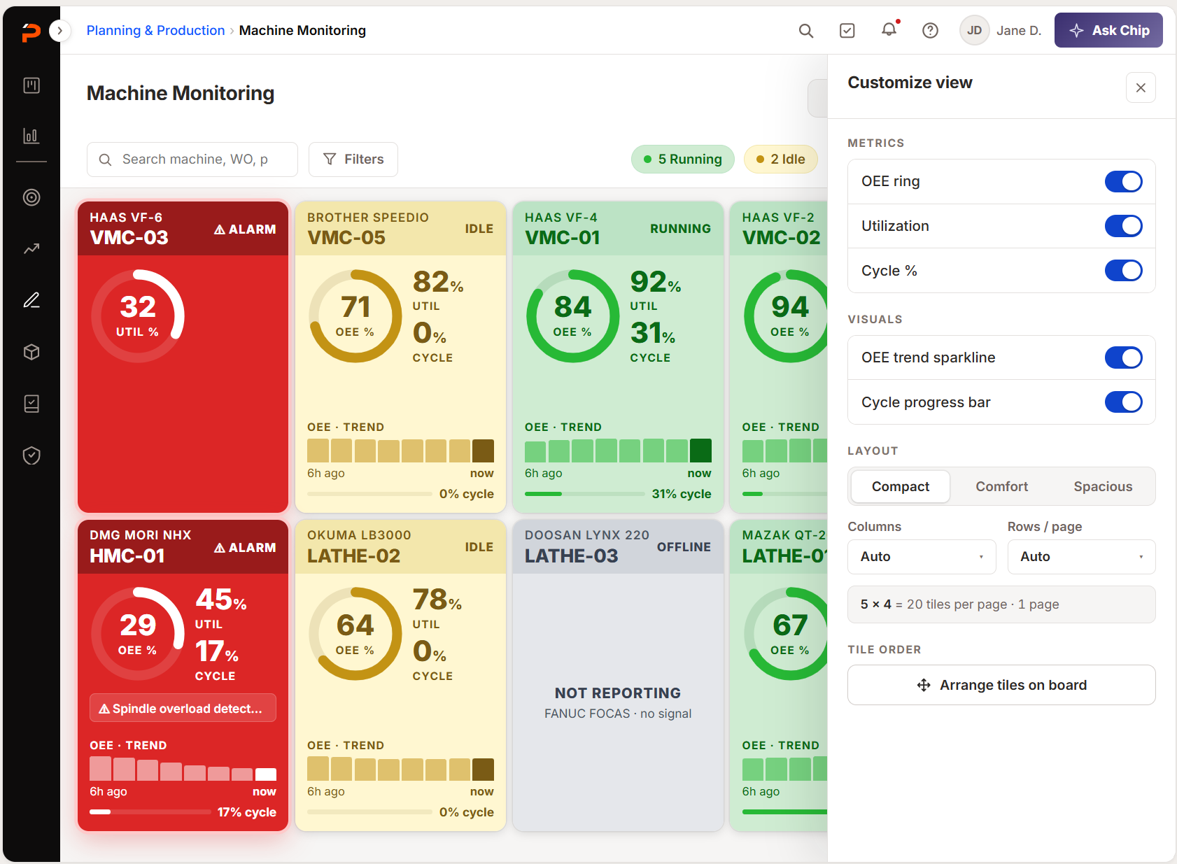
Where I pushed back on the PM
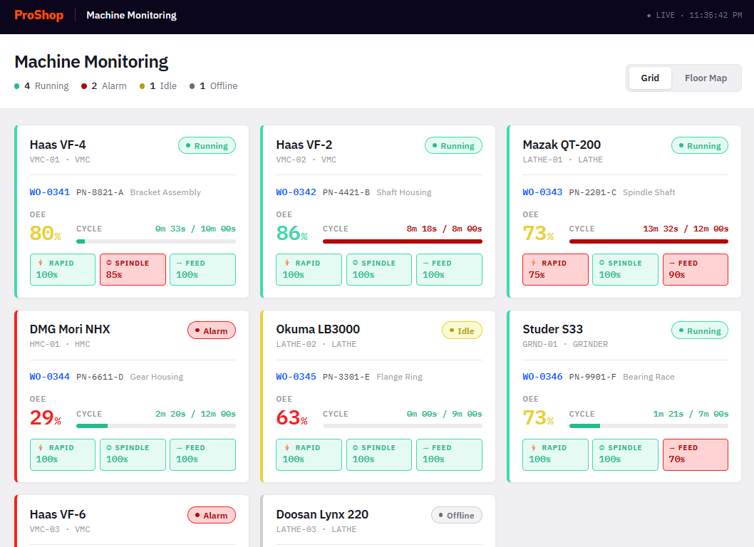
Zach wanted override signals — feed, spindle and rapid adjustments made at the control — on every card by default. No competitor surfaces them, and my objection was to the default, not the data.
An aerospace shop running tight tolerances wants to know the moment someone dials feed back; for another shop it's four more things between the eye and the status. Where a data point's value varies by shop, it belongs in preferences, not defaults.
The trade-off I lost, and agreed to
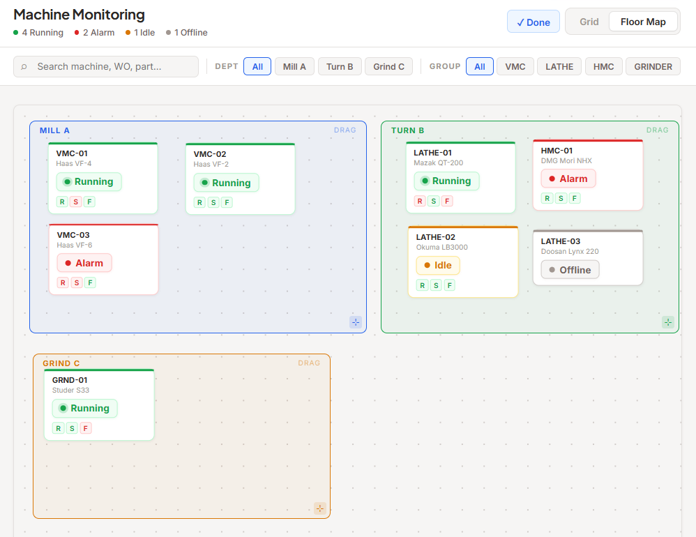
I prototyped a full interactive Floor Map — machines on a dot-grid canvas with draggable department zones.
It didn't make V1, and I agreed with the cut. Spatial positioning is expensive and closes no competitive gap; downtime root-cause coding — which all four competitors have — didn't make it either. It still paid off: the machine model stopped caring where a machine sits, which is what let Floor Status carry re-arrangement.
Opening one machine without losing sight of the rest
The question that made a supervisor click was comparative — VMC-03 is at 48%, how are the others doing? A detail view that answers it by destroying that comparison is worse than none.
Where the detail opens
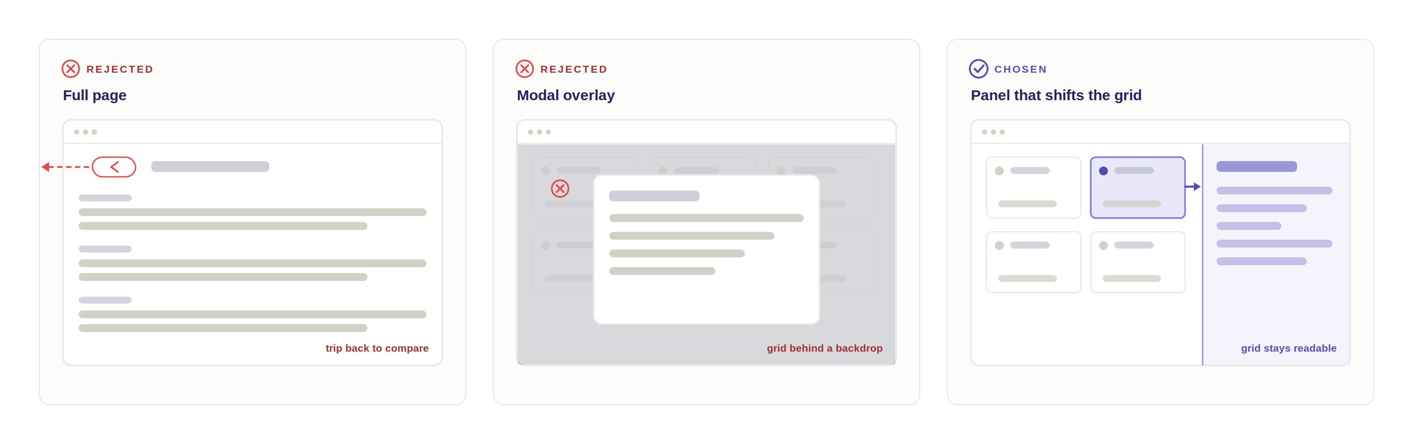
Every comparison turns into a navigation — and comparing is the reason they opened the machine at all.
More room and total focus, paid for by dimming the one thing that made them click.
The grid moves instead of disappearing — one machine in detail, the others still in view.
I argued the panel from the user's question rather than from aesthetics, which is why it stuck.
How the panel is organized
One machine holds more than a panel can — five MTConnect domains plus work order data the machine doesn't know about. Rather than one long scroll, four tabs, each answering one question, ordered to how attention moves across a shift.
-
TAB 01KPIs
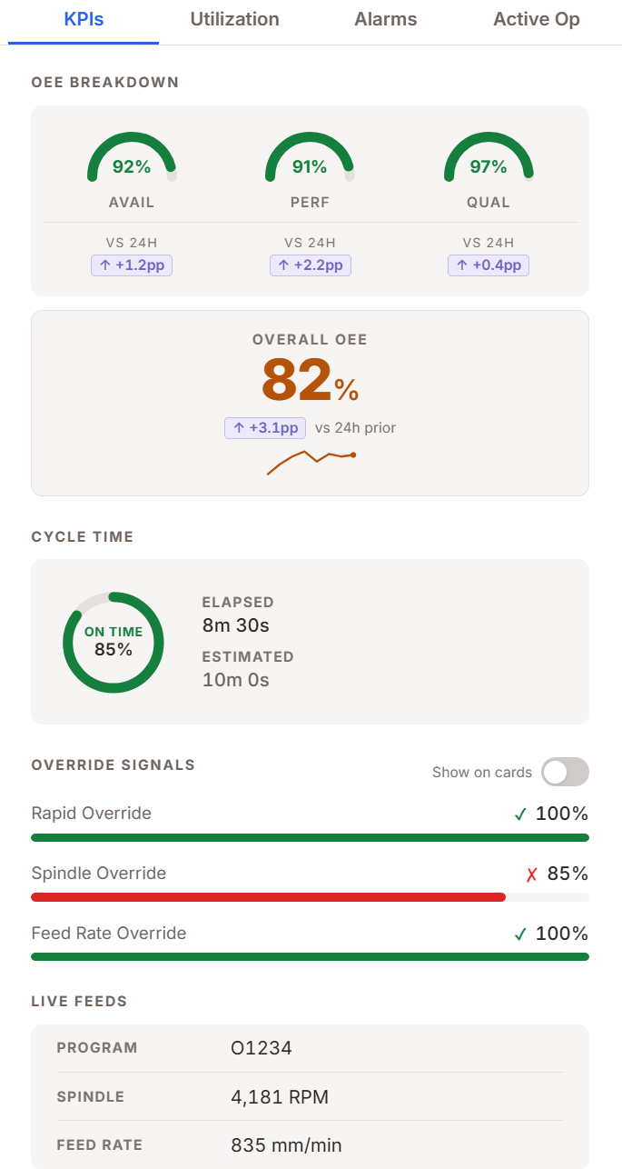
How is this machine performing right now?
-
TAB 02Utilization
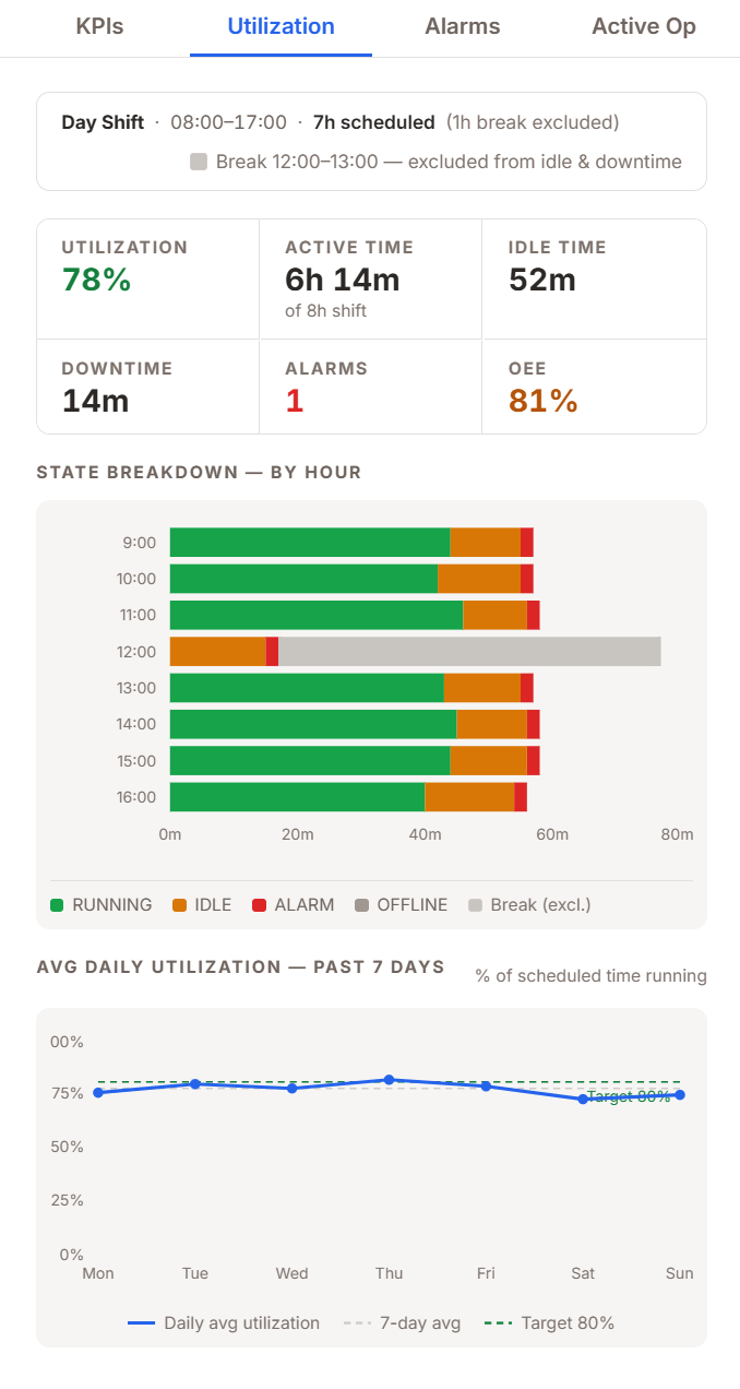
Is this normal, or getting worse?
-
TAB 03Alarms
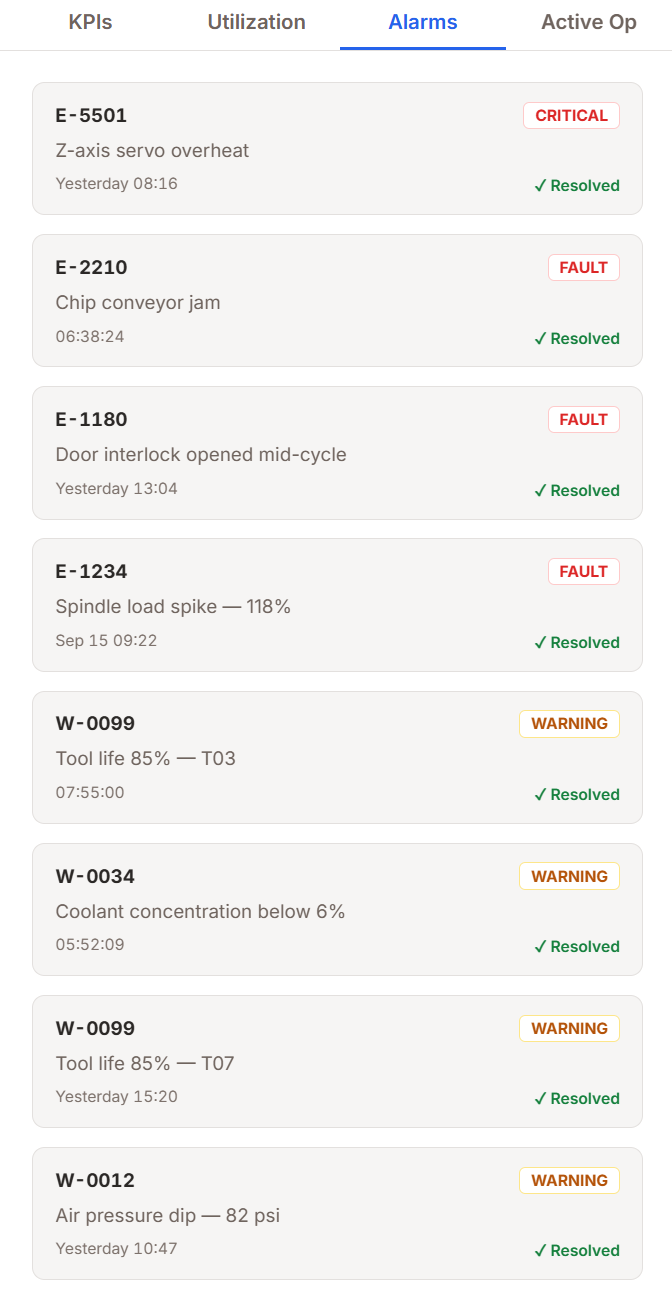
What went wrong, and what do I do?
-
TAB 04Active Op
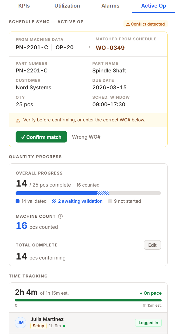
Is the right job running, and is it on pace?
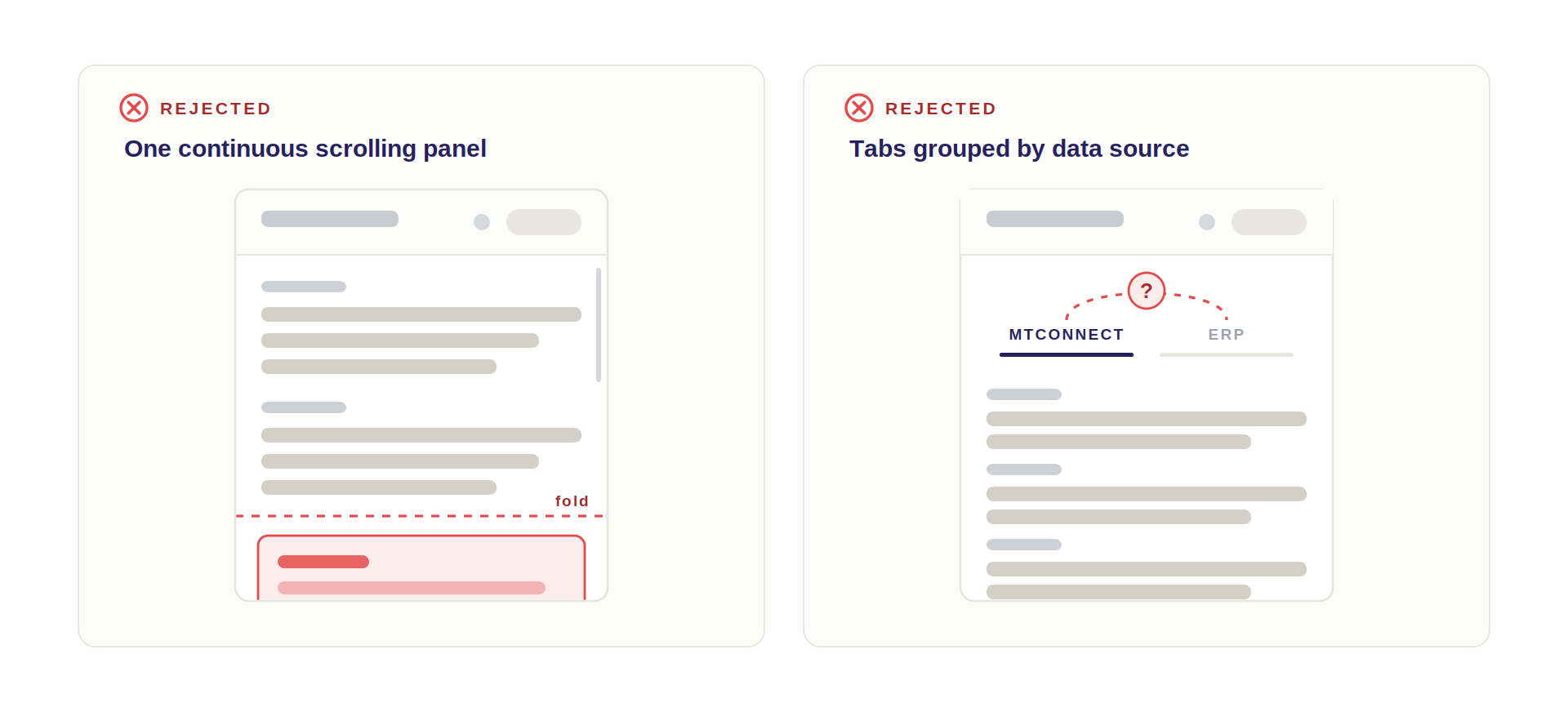
- One continuous scrolling panel — puts alarms below the fold at the exact moment they matter most.
- Tabs grouped by data source, MTConnect vs. ERP — an honest reflection of our architecture and useless to the user, who doesn't care which system a number came from as long as the screen says so.
When the data isn't there
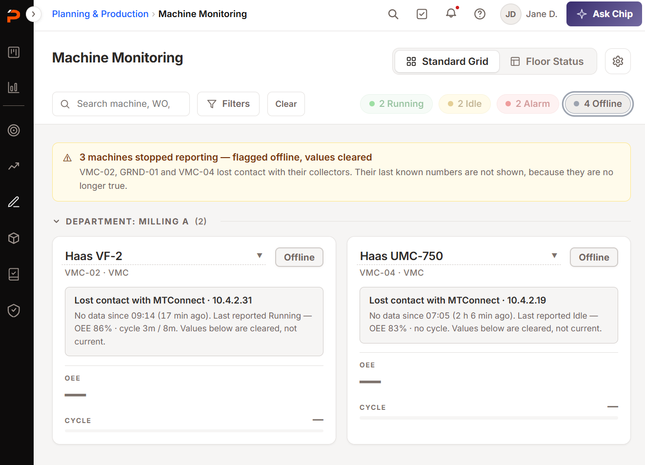
A monitoring tool spends real time off the happy path. When the collector stops reporting, a machine flags OFFLINE rather than freezing on its last known status — a supervisor trusting a stale green card is worse off than one looking at a gray one, so absence of data is itself a status.
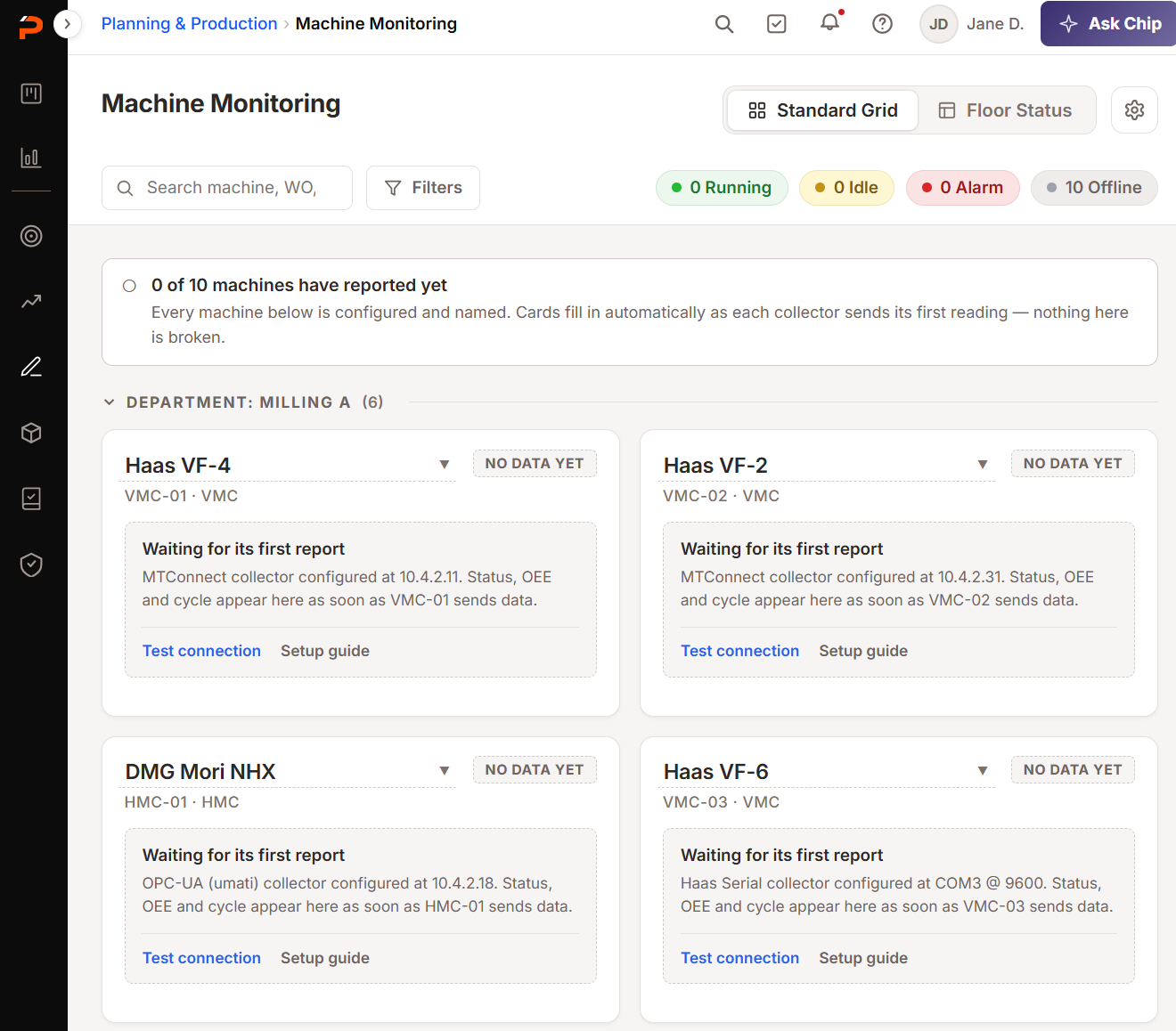
Before any machine reports, the grid shows named machines with blank cards and help text, which makes the empty state a configuration checklist wearing the interface of the finished product.
Proving the machine is running the right job
The most consequential thing I did here wasn't a screen.
Showing the active job is a display problem. Proving it's the right job spans two modules: the controller knows a program name, the schedule knows the work order. Get it wrong and every number it feeds is wrong too.
A developer works inside a module, a PM inside a feature. I was walking the whole path. I escalated it in week two as scoping, not a design workaround.
Why Schedule Sync became a state machine, not a prompt
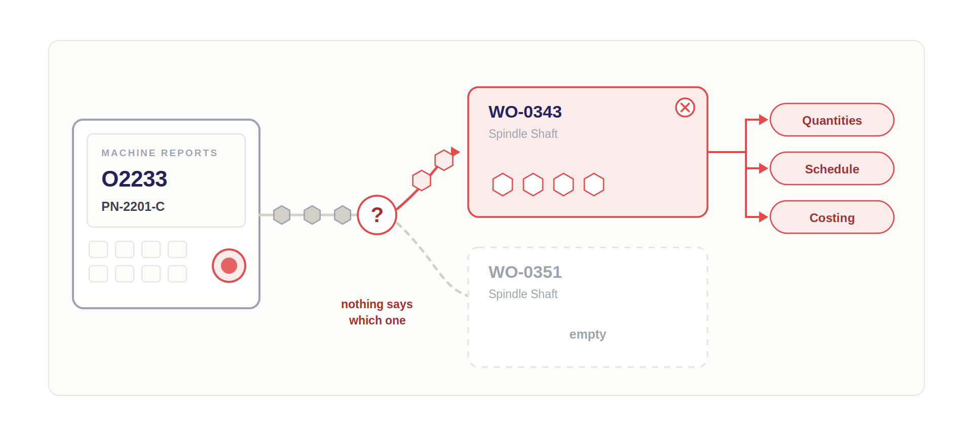
So the match is proposed rather than assumed, and it holds a pending state until someone resolves it: one click to confirm when it's right, and a work order lookup rather than a free text field when it isn't — with the correction recorded.
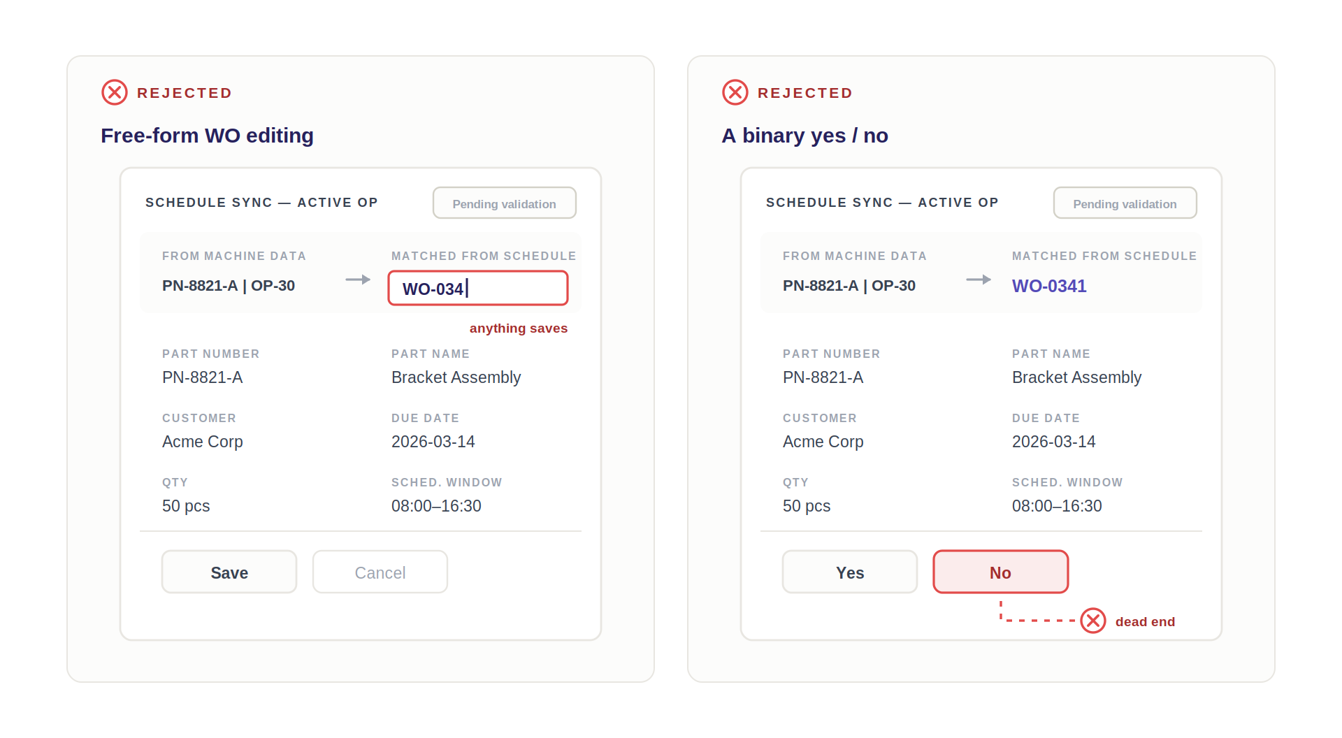
- Free-form WO editing — too error-prone for a field feeding job costing.
- A binary yes/no — leaves no recovery path.
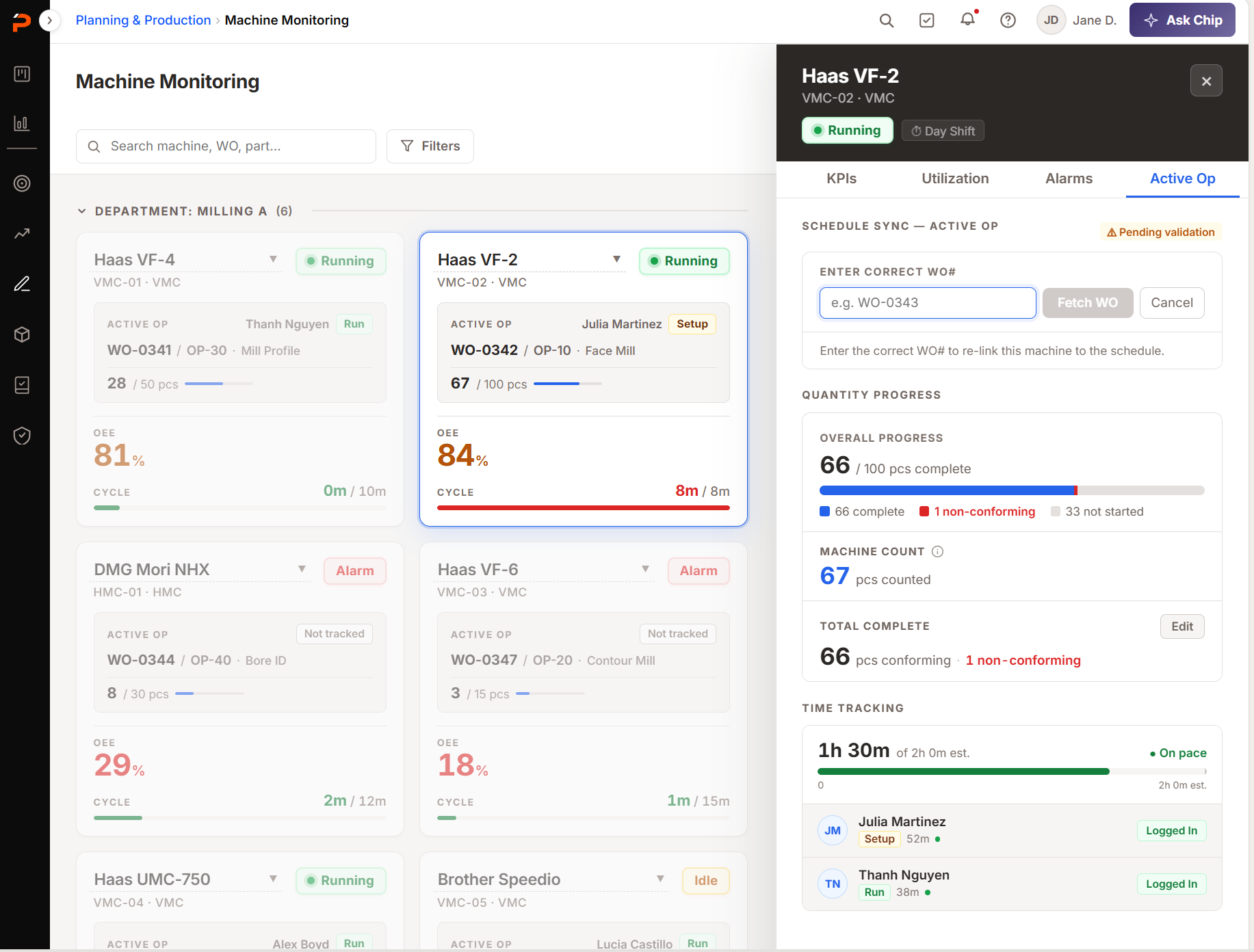
Labeling where every number came from
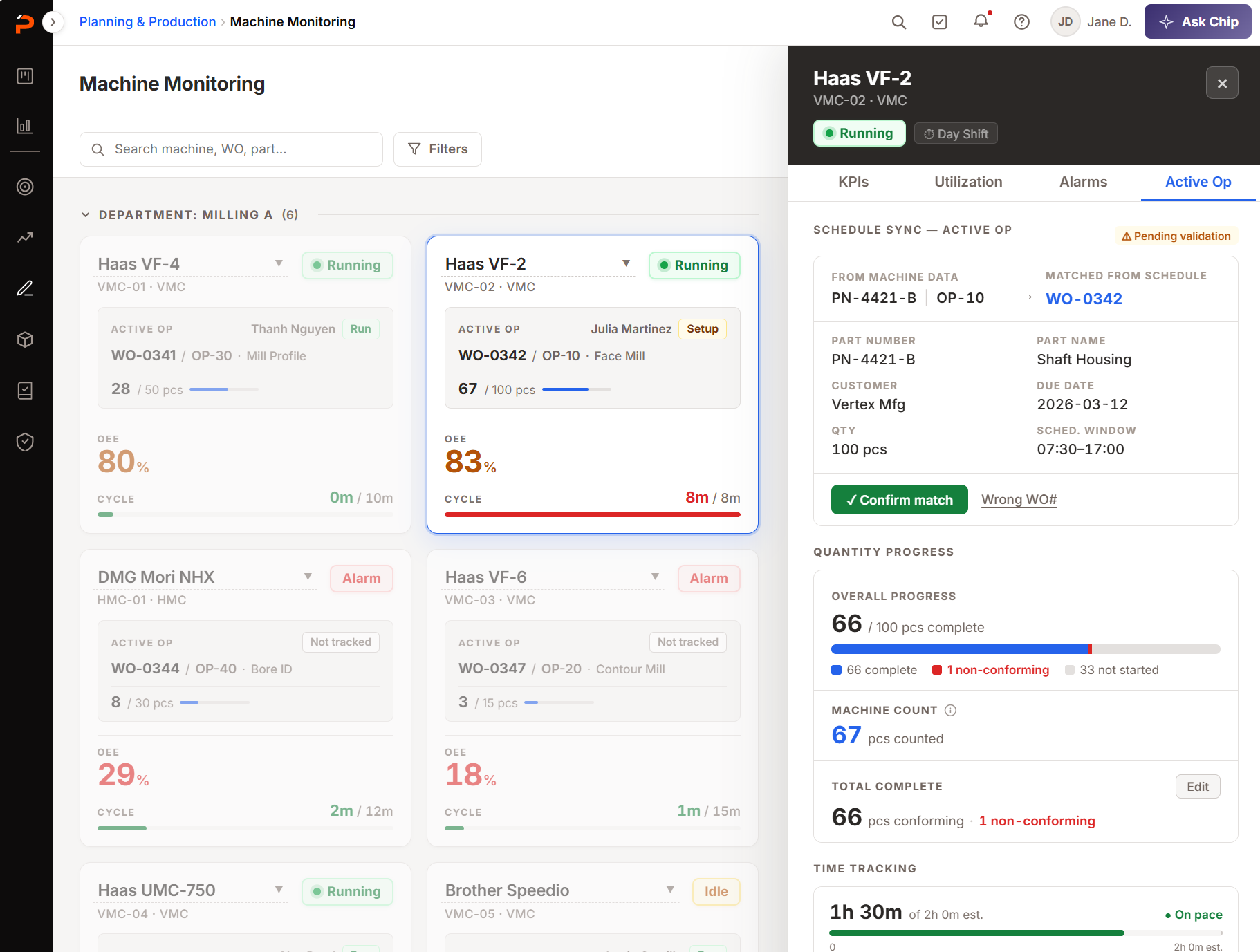
Quantity Progress splits one count into three, each labeled with where it came from.
- Qty
- WO
- The target on the work order, and the denominator on the bar.
- Machine count
- Live
- Counted by the machine.
- Total complete
- Manual
- Conforming quantity, from ProShop's NCR records. The gap against Machine count is awaiting validation or rejected.
No machine can verify a part meets spec — only a person can. That is why the conforming count is entered rather than read.
So the panel carries both counts rather than reconciling them into one — 16 counted at the spindle, 14 validated as conforming, 2 still waiting on a person. Total complete is also the only one an operator can edit: where a number comes from decides who is allowed to change it.
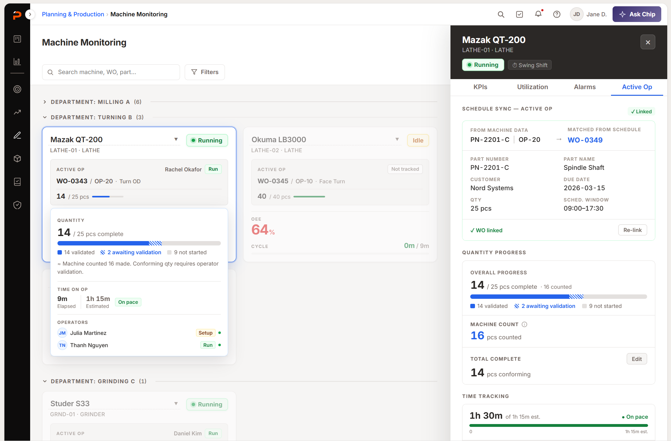
The active operation is now sourced from the schedule's first-in-queue position rather than inferred from the program name — an architectural decision our product overview cites as separating ProShop from standalone tools.
A design escalation in week two became a reason the product wins deals.
Impact
Business
- A new revenue line — a paid add-on where none existed.
- 1 of 5 capabilities marked ProShop-only in our own competitive analysis.
- Five weeks is what made the platform announcement credible rather than aspirational.
- Closed the biggest competitive gap, against MachineMetrics and JITBase — a retention story as much as an acquisition one.
User
The module is in Early Access and onsite configuration has made rollout slow, so nothing is measured yet. These are the two numbers it will be judged on.
- Machines connected — the primary target, counted per account.
- Unprompted opens — whether supervisors open the module at shift start without being asked.
- Validated so far: the data model, through SME review and one shop visit. Not the flow — nobody has used it across a real shift, on their own machines.
Org
- The first run of an AI-assisted workflow, end to end — research and synthesis through ideation, prototyping and handoff. Working out that method was a stated mandate, not a by-product.
- Two things are being reused on other platform work: the dual handoff, and the sequence where the PM builds a POC, design interrogates it, and design escalates what it exposes.
- A concept you can show in days changes what gets decided. Prototyping being nearly free is why a week-two escalation changed V1 scope rather than becoming a V2 ticket.
Reflection
-
01
Getting into the room early is a design skill
I could have received this as a brief three weeks later. Nearly every decision here was only mine to make because I asked to lead it before scope was set.
-
02
My most valuable contribution wasn't a screen
It was noticing that Schedule Sync couldn't work inside one module's boundary, and escalating it in week two. Designing the full journey is what makes those seams visible.
-
03
A finding is worth what the calendar says it's worth
One afternoon on a shop floor produced three findings of similar quality, and three different outcomes.
- Arrived in time — reshaped Floor Status, so the wall became spatial rather than a smaller dashboard.
- Arrived after the build — changed nothing, because it confirmed a decision already made.
- Arrived too late — couldn't be fixed. Cycle times needed in seconds, not minutes, asked for in week 5, which is why I'd fight for shop-floor access in week 1.
Next case study