Operators had learned to work around the ERP. Its screens were built for authoring and used for running, so the floor kept its own paper copy of the plan. I spent months on shop floors, then designed one screen for the person at the machine — clock in, set up, run, inspect, complete — built on the work order, NCR and time-tracking records ProShop already kept.
My bet: get the in-ERP operator experience good enough and customers stop needing a bolt-on MES layer.
At stake
Target35%DAO ratio within 12 months of GA
Best fit25+Machinist shops with specialized operators
Consolidation5 WOs → 1A typical operator's day, on one queue
What an operator's day actually looks like
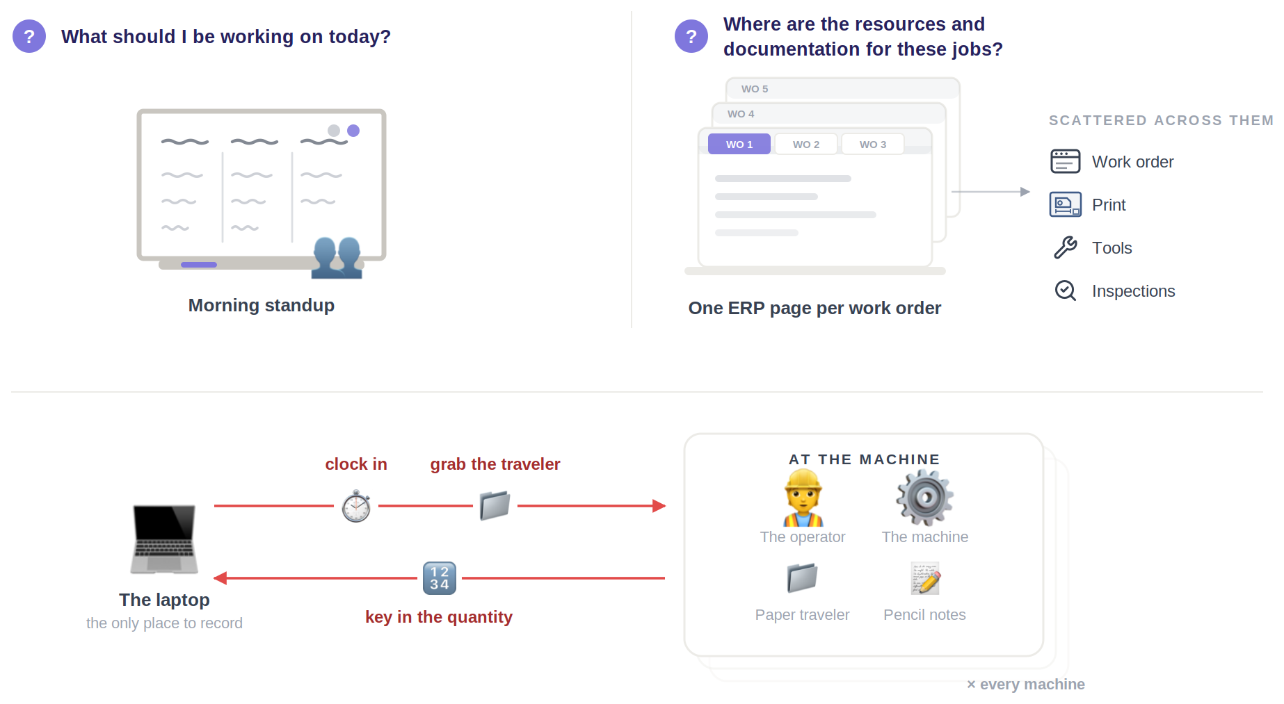
This starts before software. In the paper era an operator carried the traveler — a physical file folder — to the machine and wrote process notes into it as they worked. The tools went digital; the operator's two morning questions never changed.
The two questions
Both questions, verbatim from shop visits — and both answered away from the machine: the day at a standup, the documentation spread across one ERP page per work order. Whatever gets captured at the spindle still walks back to a laptop, once per machine.
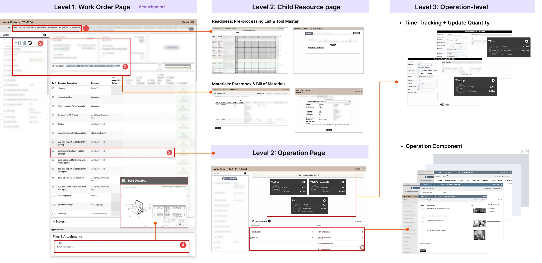
In legacy ProShop neither question has one place to be answered. Instructions live across work orders and inside each operation, and an operator has to clock into every job separately to start tracking time or update a count.
Jobs5An ordinary day
Readiness checks5Per work order — BOM, part stock, tools, drawing, PP checklist
Operation pages20+4–5 component pages each, plus time tracking
Clock-in modals20Plus inspection tables and NCRs
Legacy workflow map
And between every one of those, a context switch: is pre-processing finished, where is the material, are the tools ready?
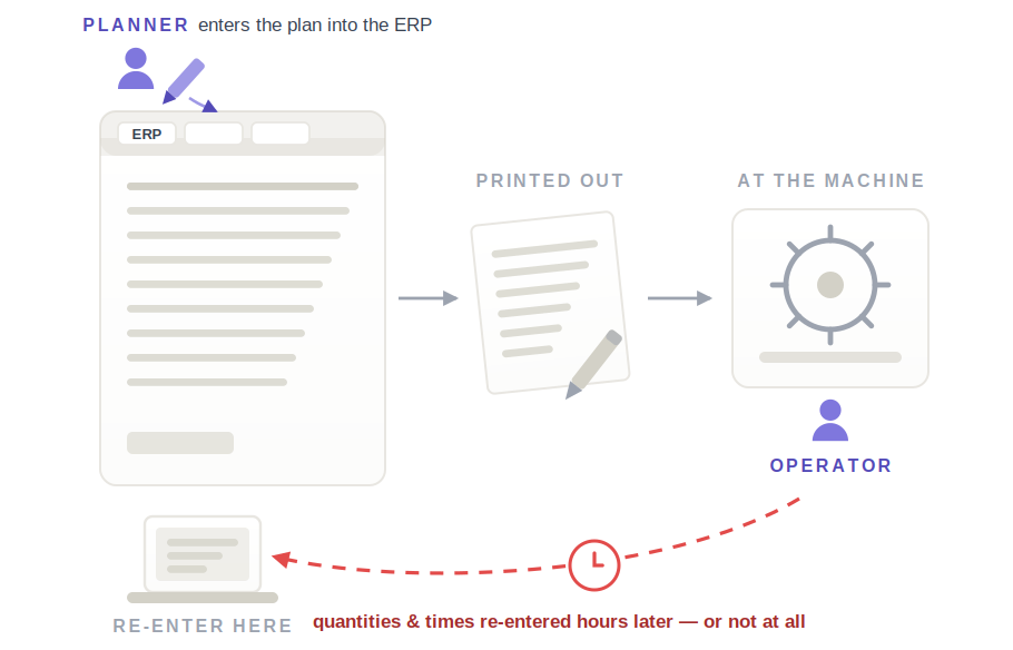
On shop visits I still watched crews print the WO page and OP table for pencil notes at the machine, then walk back to a laptop to re-enter everything — the paper traveler, reinvented inside a paperless system.
Three problems, and the evidence for each
P1The day · what should I be working on?
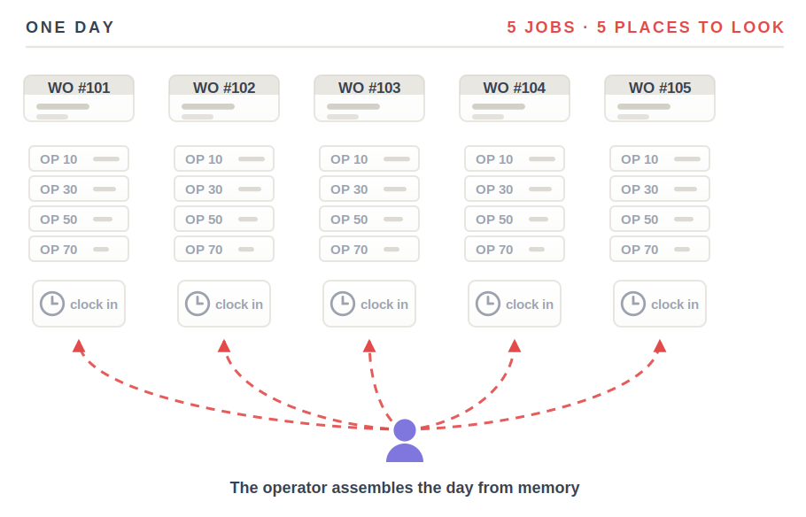
Five jobs, five places to look
Five work orders, twenty-plus operation pages, twenty clock-in modals — and nothing that assembles the day, so the operator builds it from memory before the first cut.
Shop visitsTime on shop floors across the customer base, before any UI. The two morning questions, the five-jobs-twenty-modals arithmetic and the print-then-re-enter workaround all came from watching.
P2The work · where is everything I need?
Screens built for authoring, used for running
So operators print the pages and take a pencil to the machine, then walk to a laptop to key it in. The numbers land late, or never.
Shop visitsTime on shop floors across the customer base, before any UI. The two morning questions, the five-jobs-twenty-modals arithmetic and the print-then-re-enter workaround all came from watching.Prospect callsVermes Machine raised operator usability unprompted; Ember CNC built their demo request around tablet access at the machine.
P3Getting started · what does it cost to begin?
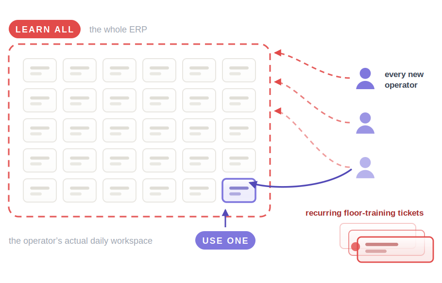
Every operator learns the whole ERP to use one corner of it
The cost lands at go-live and again on every hire. It reaches us as recurring onsite floor-training tickets — a product problem paid for as a services problem.
Jira ticketsRecurring onsite shop-floor training tickets — the rollout cost showing up in the queue instead of in the product.
Operator usability has become an ERP selection criterion — not a nice-to-have. Vermes Machine raised it unprompted on a call, and Ember CNC built their whole demo request around tablet access at the machine and a schedule a machinist can read at a glance.
How might we give the person at the machine a screen built for their actual day — clock in, run the op, capture what the work order requires — without ever leaving the ERP?
What I shipped
One screen, inside the ERP a shop already owns, for the person at the machine — learned once, instead of thirty modules deep. Four decisions hold it up, and I took each one from something I watched on a shop floor.
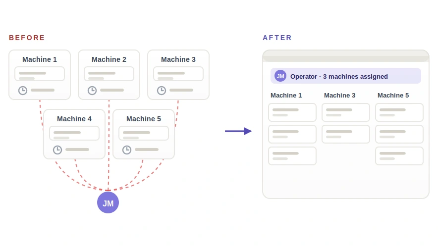
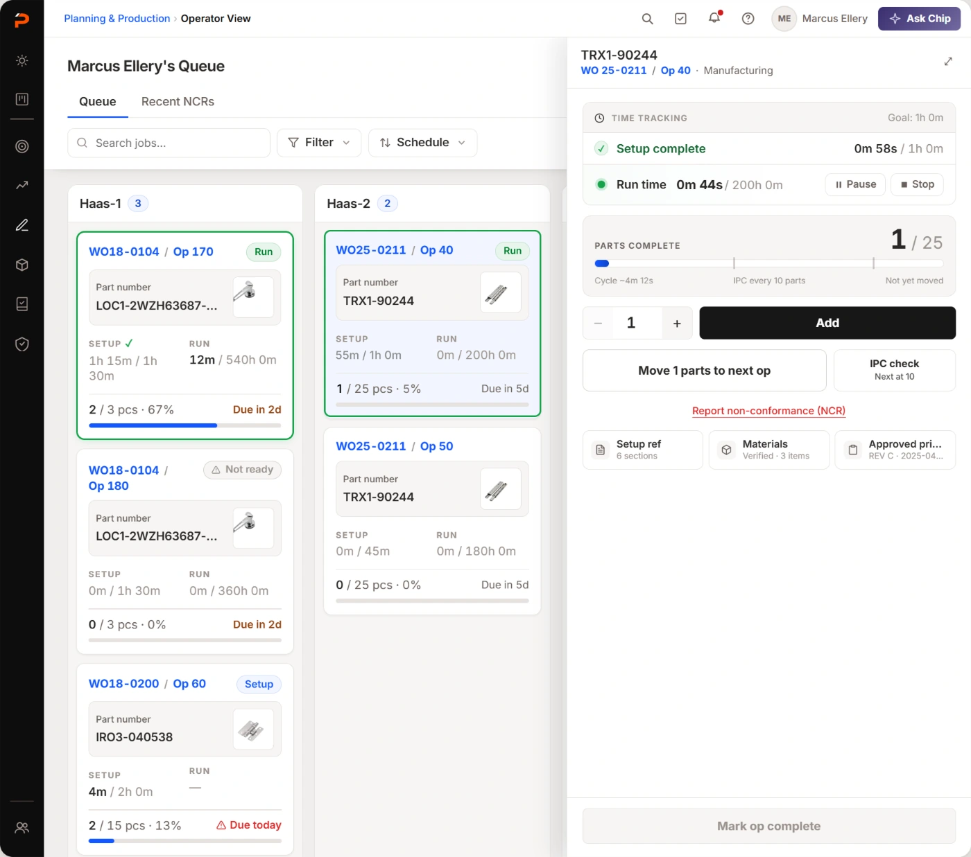
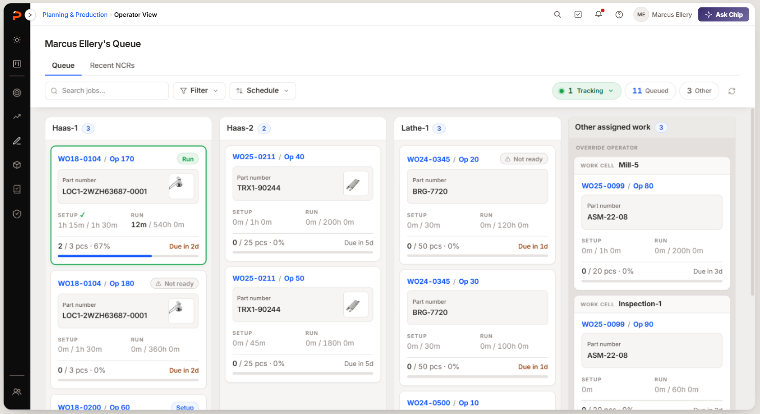
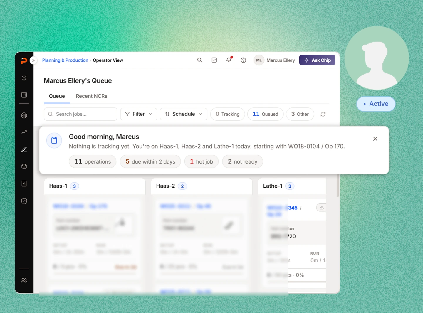
One queue for every machine you’re on
Every machine an operator is assigned gets a column of job cards, all on one screen. It knows which machines those are from their login.
Before this, operators put the day together from memory every morning.
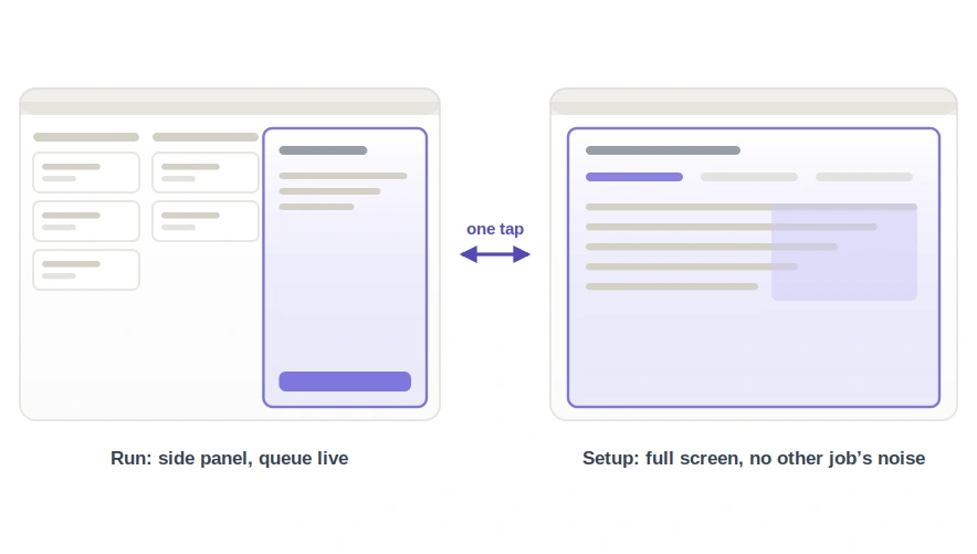
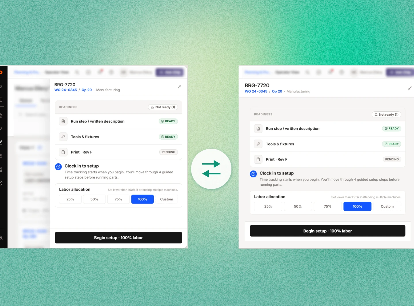
Two ways to open the same job
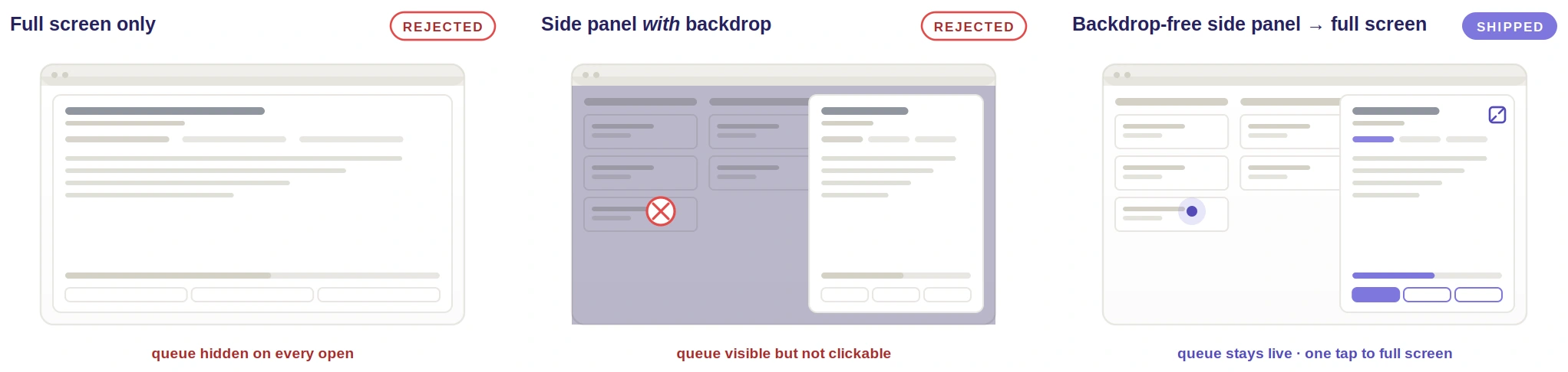
Running opens a side panel with the queue still live behind it. Setting up takes the full screen. It is the same job either way, one tap apart, flow groups included.
Running and setting up want opposite things, so I stopped asking one layout to do both.
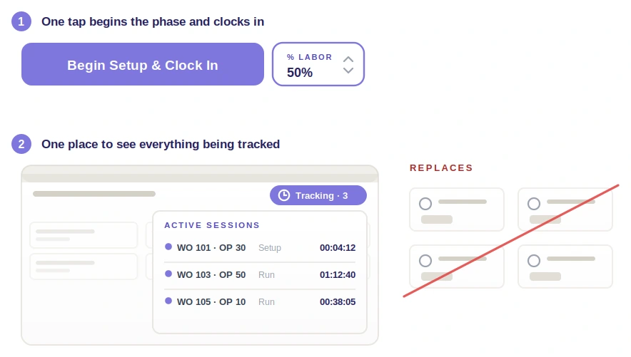
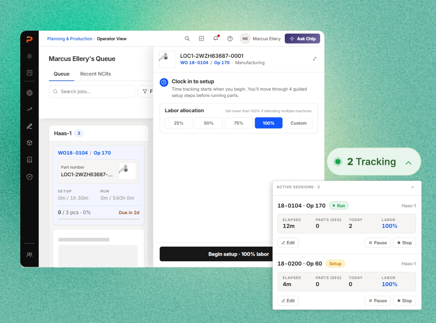
Clocking in by starting the work
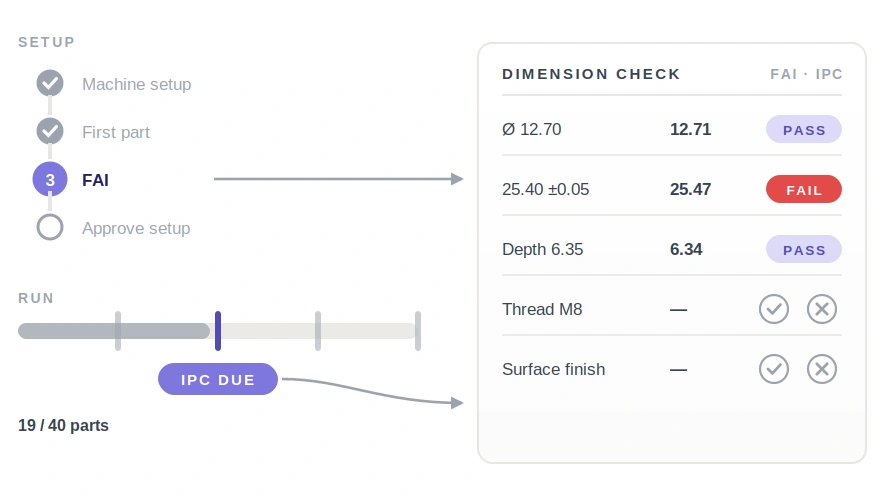
“Begin Setup & Clock In” is a single action. If a machinist is splitting attention across four machines, they set a labor percentage first.
That is twenty clock-in dialogs a day gone.
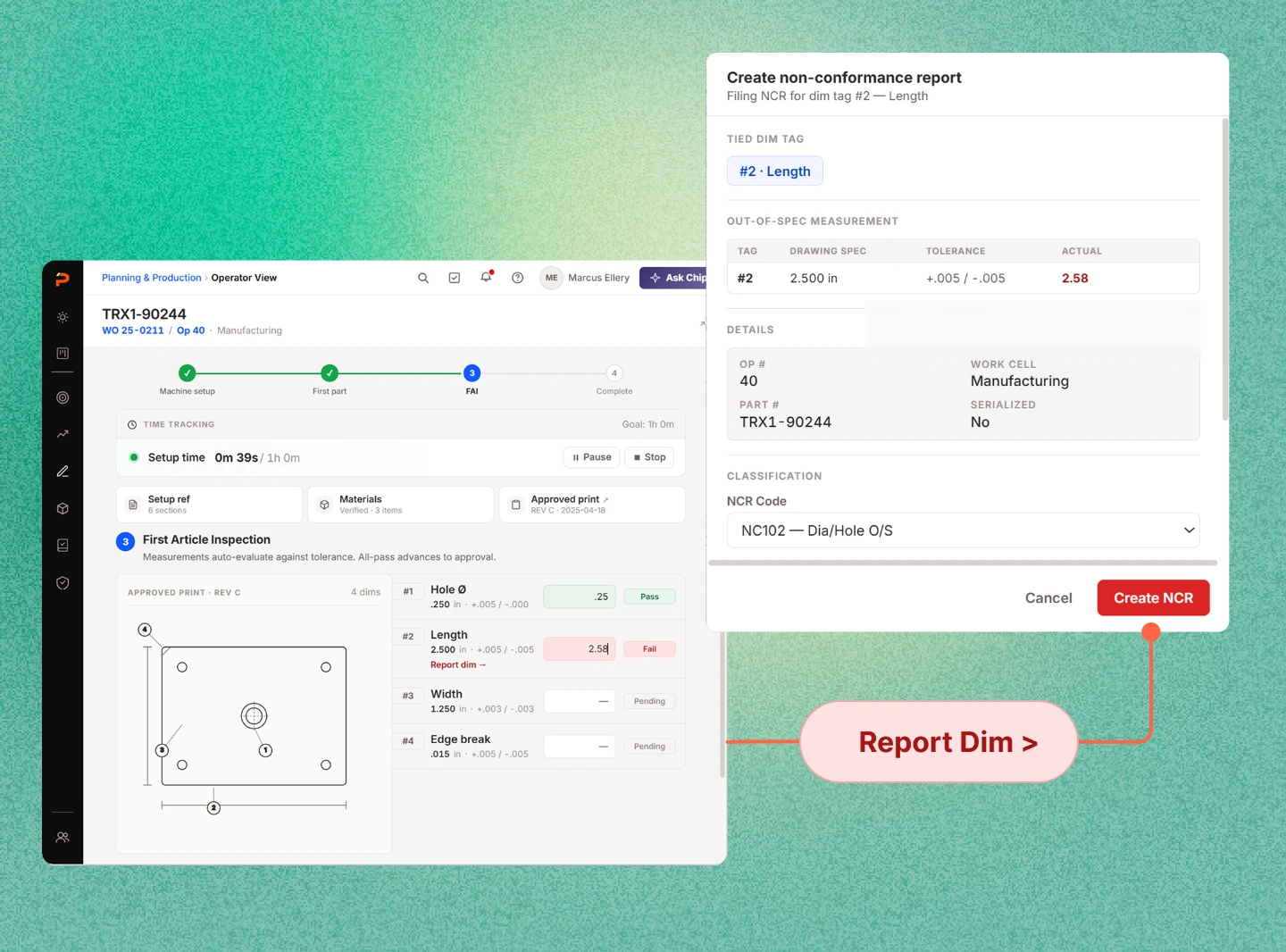
Rejecting a part where it failed
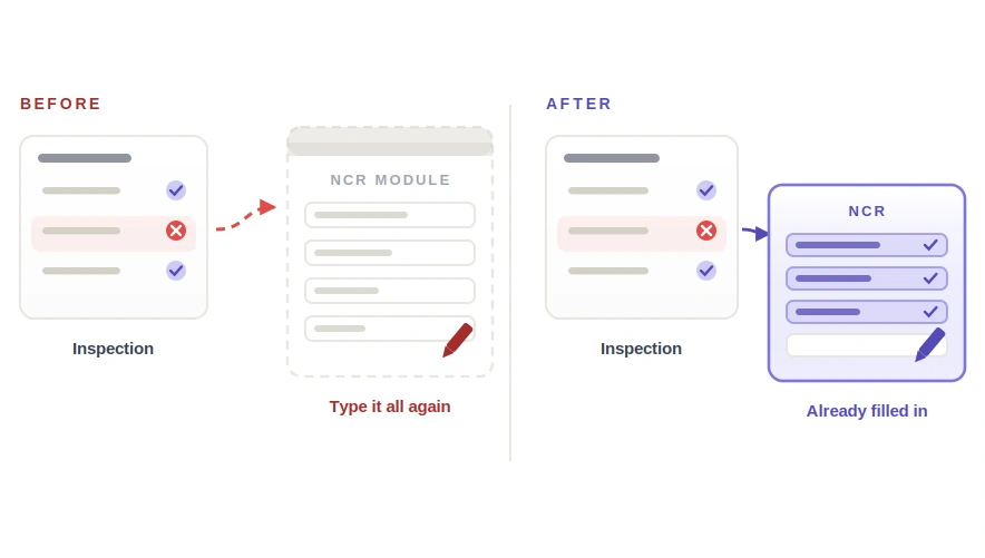
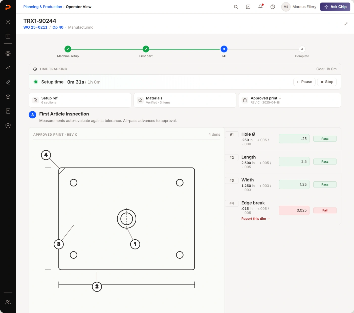
Dimensions are entered against the approved print, and a failed one raises the reject right there — with the work order, operation and part already filled in.
No printout, no pencil, no walk to the NCR module.
What I learned on shop floors
Before I drew any UI I spent time on shop floors across the customer base. Execution efficiency came up more than anything else, and it gave me the three things this project turned on: the two morning questions, the five-jobs-twenty-modals arithmetic, and the print-then-re-enter workaround.
Those visits didn't just tell me what was wrong; they set the bar. If this screen doesn't beat a paper printout at the machine, operators will keep printing.
From there I mapped the operator's day end to end, before any screens.
Step 01AuthenticateRole comes from the user account.
Step 02Queue overviewAssigned machines, one card per job.
Step 03MaterialsIs the job actually ready to run?
Step 04Prep & setupClocked in from the first tap.
Step 05Run & completeCounts, checks, moves, then the card drops off.
Then I went looking at what already existed
Shop visits told me what was broken. They could not tell me whether somebody had already fixed it — or whether a screen for operators inside the ERP was the right idea at all, rather than the bolt-on layer the market seemed to have settled on. I did not want to spend a release rebuilding something a customer could buy on Tuesday.
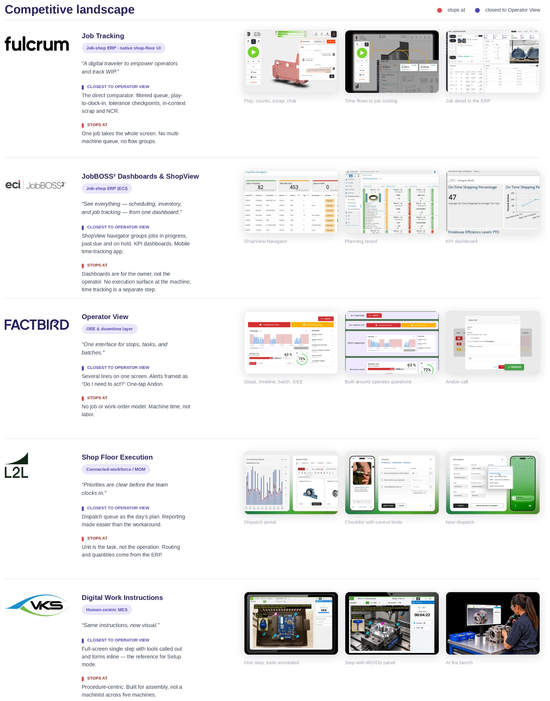
So I scanned five products operators actually stand in front of — two job-shop ERPs, an OEE layer, a connected-workforce platform and a work-instruction tool — and read each one against the day I had just watched. Three questions:
Q1Has this already been solved?
If a product genuinely covers the operator’s day, the honest answer is to integrate with it, not rebuild it.
Q2Where does each one stop?
One vendor’s missing feature is a roadmap item. The same wall in all five is a gap in the market.
Q3What is worth borrowing?
Patterns a machinist already knows cost nothing to teach. I wanted to find them before I invented anything.
Competitive board
What the scan told me
Every product owns one slice of the day, and nobody owns the day itself
Fulcrum takes the job, JobBOSS² the dashboard, Factbird the machine, L2L the task, VKS the procedure. A day crosses all five, so today the operator is the integration.
Nobody had built the multi-machine queue
The closest thing to it still gives one job the whole screen. Nothing here scans several machines at once, or runs several operations as one session.
Two patterns were worth borrowing outright
Fulcrum’s play-to-clock-in became “Begin Setup & Clock In”. VKS’s full-screen single step became Setup mode.
Being inside the ERP is the part we can defend
The best operator experiences here are bolt-ons — a second login, an integration to keep alive. They ask the ERP for routing and quantities. We already have them.
Then I put both halves into one model — the day I had watched, and the gap the board left open. This is where the two modes and the flow group stopped being things I had noticed and became structure I could build on.
State machine
What I found, and what I did about each one
01
The day is scattered across work orders and operation pages
I scoped the queue to whoever is logged in. Each machine gets its own column, and the grid holds one to five of them without ever scrolling sideways.
02
Operators work in two modes
I built two workspaces instead of one — a side panel for running, the whole screen for setting up.
03
Time tracking fails as a chore, works as a side effect
I made clocking in and starting setup the same button. A machinist splitting attention across four machines sets a labor percentage, and the setup steps run with the clock already going.
04
Inspection checkpoints get skipped outside the loop
I put the first-article check inside the setup steps, as step three, where a measured number either falls in tolerance or it doesn’t. The in-process checks became markers on the run bar, spaced to how often the part actually needs checking rather than to a clock, and they only wake up when one is due.
05
A failed dimension sends the operator to another module
I let the reject be raised from the dimension that failed. The work order, operation and part come with it, so a rejection stops being a walk to another module and a second round of typing what the system already knows.
Two modes for two ways of working
When an operator opens a job, what is the workspace? I started from how operators actually work, and the two styles want opposite things.
Multi-tasking across machines
The queue has to stay visible. Running a job is a fast, repetitive loop — the thing an operator does dozens of times a shift — and it wants short eye travel and big tap targets. Wants a side panel.
Focused on one operation
Setup is reference work — instructions, prints, dimensions — and when an operator isn't juggling machines it deserves a space with every other job's noise removed. Wants full screen.
How might we keep five machines in view for the operator who is juggling them, and take everything else away for the one who isn't?
Three options
Every part-count tap becomes a context switch, which punishes the one loop operators repeat all day.
So the operator juggling machines loses the background sense of what the others are doing.
Each way of working gets its own shape — and one tap trades awareness for focus.
Setup · full screen
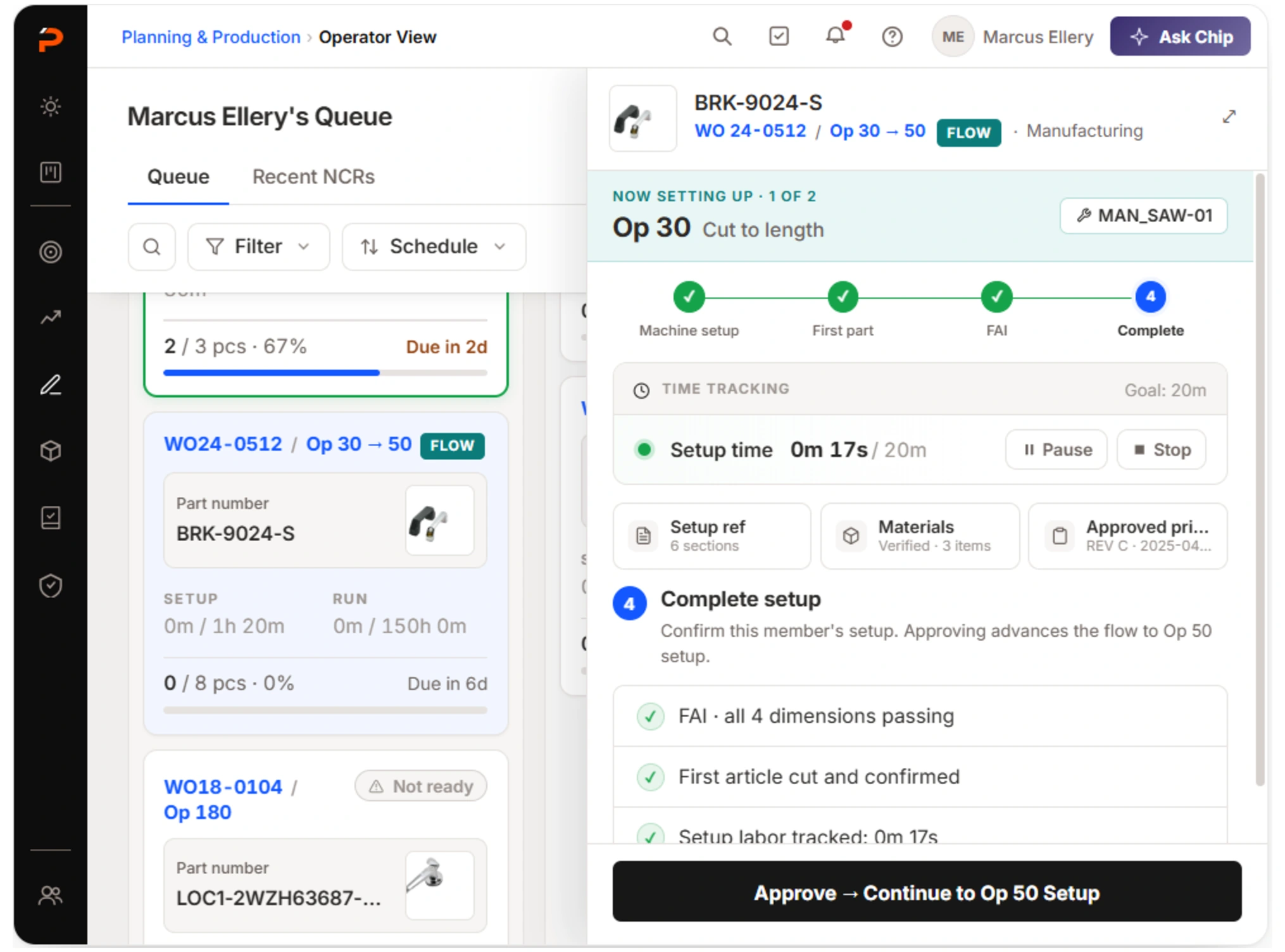
Setup gets the whole screen: the print, its four dimensions, and a failed edge break with the only action it needs. Nothing else competing.Run · side panel
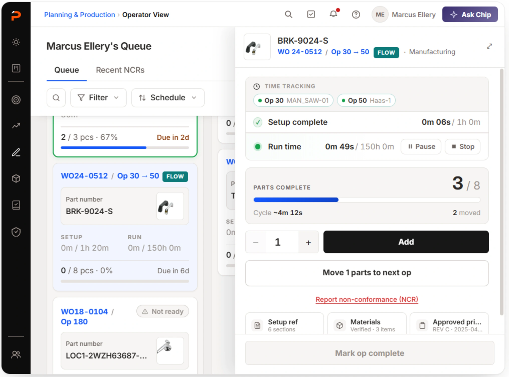
Run keeps the queue live behind it: count, IPC countdown and the NCR link within thumb reach, four other machines still in view.
Why flow groups had to be built in
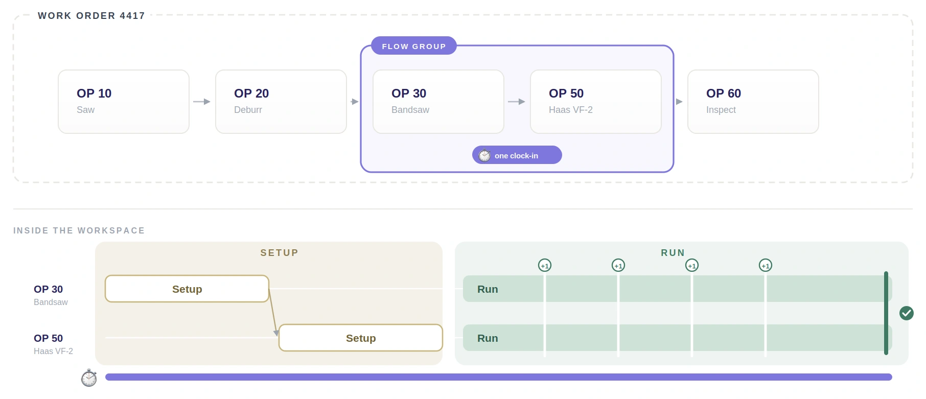
Operators genuinely run several operations at once — OP30 and OP50 as one working session. A generic job-detail page flattens that, so I built that session into the model rather than leaving it to be patched on later.
Flow group model
One clock-in covers the group. The setup wizard resets per operation while the clock keeps running, and a part added once counts for every member — no artificial clock-out in between, and nothing entered twice.
On screen I gave flow-group cards, the stepper and the active member their own color, so a shared session is never mistaken for a single operation.
Flow group · setup
Flow group · run
What operators changed when they drove it themselves
I handed the working prototype to the people who run this process daily and let them drive it instead of walking them through it. Four changes came back that a flat mockup would never have produced — reviewers had to make the decisions the flow asks for, not just look at them.
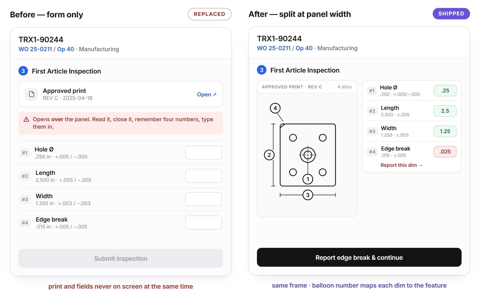
01Nobody can read a print and a form at once
Before
Form-only entry, so the operator flips between the print and the fields.
After
Split layout in both modes — print and fields together. Trivial in full screen; in the panel it cost the tolerance column and a type size, which I paid because reading the print and entering the number is one task.
Change 01 · before / after
02Not every part can be self-certified
Before
The operator self-certifies past setup.
After
The operator initiates QA inspection from the flow, sees in-progress status, and is blocked until QA passes — a real human gate in the sequence.
03Below the fold meant invisible
Before
A below-the-fold section, which made overridden-operator jobs invisible without scrolling.
After
A dedicated far-right queue column. Everything on one screen.
04One rejection, not one per dimension
Before
One NCR per dimension, plus a manual "is this part serialized?" checkbox — which is derivable from the part number.
After
One NCR carries multiple dim tags, serialization is auto-derived, and an NCR records list sits on the queue for traceability.
The one question I left open
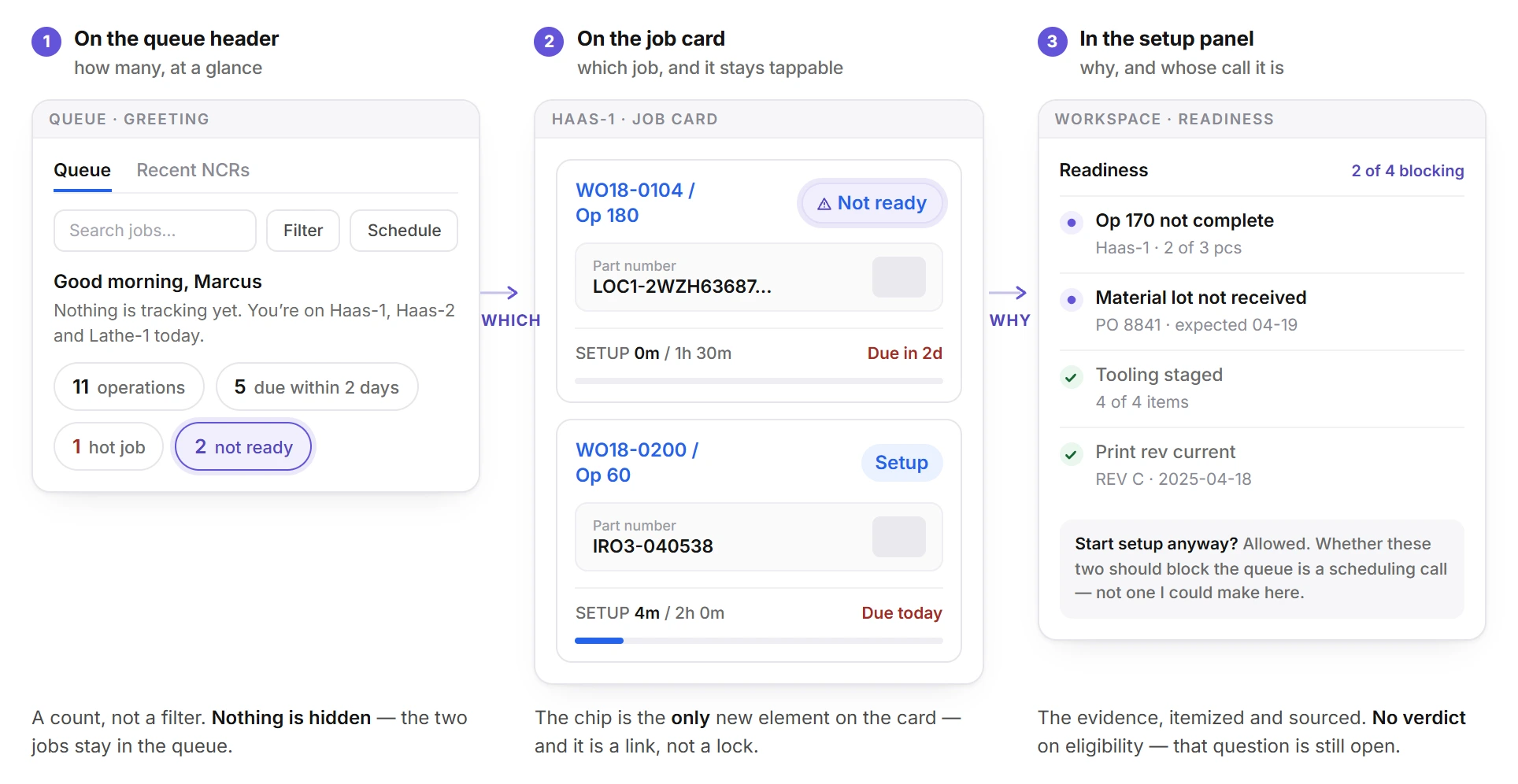
What makes a job eligible for the queue when upstream components aren't ready? That is a planning and scheduling question as much as an operator one, and closing it on my own would have been a guess dressed as an answer. So I shipped the evidence rather than the verdict — a readiness chip on every card, deep-linked to the checklist behind it. It is what the “2 not ready” count is counting on the queue, and what the readiness list spells out in the setup panel.
Readiness · three places
RejectedGraying out the whole card — it hides why a job is blocked, which is the only part the operator can act on.
One shift, end to end
Everything above is a piece — a queue, two modes, a flow group, a readiness chip. This is the built thing running as one shift, on the same five-step day I mapped before I drew any of it.
Six clips, in order, nothing cut out between them.
01
Morning
Open the queue — three machines, eleven operations, two not ready.
02
Pick a job
Readiness checks first, then Begin Setup & Clock In — one tap, no separate dialog.
03
Setup
Full screen, the print and its dimensions, and an FAI with one dimension failing.
04
Reject
The NCR is raised from the failed dimension, where it failed.
05
Run
Side panel, queue live behind it, count and IPC countdown within thumb reach.
06
Complete
Move the parts, close the op, and the card drops off the queue.
Delivery, and where AI fits
Everything lands on the same work order, NCR and time-tracking records the rest of ProShop runs on — no parallel system to reconcile, which is the whole reason to build this inside the ERP rather than beside it.
What AI should and shouldn't do here
Version 1 is deliberately not an AI-automated workflow. The value is in getting the workflow right first.
CandidateAI can shorten thisNever movesOperator still decides
Inspection (FAI / IPC)
Dim capture, and a pass/fail suggestion against tolerance
→
Operator confirms
→
The pass/fail that goes on the record
Quantity updates
A count suggested from machine signals
→
Operator confirms
→
The count, before it commits
Live machine data
Real-time context surfaced in the workspace
→
Operator confirms
→
Every state-changing action
Read down the purple column, not across: it is the same step in all three.
Where AI did change this project was the handoff — what I gave engineering to build from.
Instead ofA redline
Static screens with annotations. Every state that isn’t drawn has to be inferred.
→
What I handed overA working React prototype
The full workflow state model implemented — setup wizard, flow-group session, inspection gates, NCR. Engineering read the interactions by running them.
Alongside itThe Figma research file
The shop visits, the competitive scan and the options I rejected, so the reasoning behind a screen was available without asking me.
Impact Estimated
Early Access is live with the Brain Trust cohort and the module is pre-GA, so every number here is a target rather than a result. They are the numbers the team agreed to be judged on.
Primary target35%DAO ratio target within 12 months of GA
Rollout gate70% / 60dPer-shop adoption threshold; below it, rollout counts as stalled and CS engages
Alignment1 definitionDAO agreed across Product, Marketing and CS before launch
DAO = operators who clock in and time-track at least one WO operation via Operator View, divided by all operators clocking in across ProShop AI.
Getting one definition agreed before launch is the part I'd defend hardest — three teams reading the same number is what makes the 35% worth arguing about at all.
The prototype-in-code handoff also set a precedent for how design hands off workflow-heavy modules on this team.
Reflection
01
Design the day, not the screen
The workflow map came before any UI. That's why flow groups, % labor and IPC cadence live in the product instead of arriving later as post-launch escape hatches.
02
Field research sets the bar, not just the brief
Watching operators print pages for pencil notes defined the real competitor: paper. Every density and tap-target decision traces back to beating a printout at the machine.
03
Saying who it isn't for is what kept it focused
The go-to-market brief names the worst-fit user out loud. Holding that line in the design is what kept Operator View from drifting back into the general-purpose screens it replaces.

 One queue for every machine you’re on
 Two ways to open the same job
 Clocking in by starting the work
 Rejecting a part where it failed